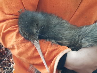
Hello!
Thank you to my sponsor for looking after me!
- Name Tane
- Gender Male
- Species NI Brown Kiwi
- Tx Type Chicktimer
- Tx Frequency 65
- Next Tx Change Apr 27, 2022
- Incubation Status No
Activity Graphs
Mean Activity Over the Last 6 Months
Hovering the mouse over the data points (blue dots) will show the exact value for that reading
Mean Activity and Night Time Duration Over the Last 6 Months
This graph shows the numbers of minutes that the kiwi was active (represented by the blue area) and the total number of night time minutes (represented by the sum of blue and grey areas). Hovering the mouse over the data points (blue dots) will show the exact value for that reading
Mean Activity and Time of Emergence Over the Last 6 Months
This graph shows the numbers of minutes that the kiwi was active (represented by the blue line) and the time of emergence.
Hovering the mouse over the data points (black stars or blue dots) will show the exact value for that reading. You can zoom into an area of the graph by holding down the left mouse button and drawing a rectangular shape
Time Of Emergence And Sunset Time Over the Last 6 Months
This graph maps to scale the time of emergence and the sunset time. The yellow area above the yellow stars (sunset line) represents day time, and the area below it represents night time. The black line represents the time of emergence. The graph might show that the kiwi has emerged during daylight, this is possible but it can be also influenced by the accuracy of the kiwi location, the precision of the reading time, or the accuracy of the transmitter data itself (up to one hour). Hovering the mouse over the data points (yellow stars or black dots) will show the exact value for that reading. You can zoom into an area of the graph by holding down the left mouse button and drawing a rectangular shape

Not Incubating
-
Latest Measurements (Oct 29, 2021)
-
Weight
2040g -
Bill Length
100.7mm -
Tarsus Width
11.0mm -
Condition
Good
-
Identification
-
Band
R65842 -
Microchip
N/A -
DNA Collected
No